Winner How Magazine Self Promotion 2012 Design Competition


To view the other How Magazine 2012 Self Promotion winners go to:
http://www.howdesign.com/design-competitions/design-award-galleries/2012-how-promotion-design-awards-merit-winners-designers-self-promotions/

Mohawk Paper's recent press release and site post under Great Work Communications the new promotional piece Fruit For Thought. Thank you Mohawk. I am in good company with the other people recognized. Here is the link and a blurb from the review:

The Boston-based freelance designer thrives in design challenges and enjoys creating work that is totally unique, un-mimicked by any other designer or design firm. Her self-promotion, submitted to this year’s Mohawk Show, was no different. She takes patterns, colors, and textures that one would not ordinarily think fit together, and pieces them together in unusually brilliant ways. Her self-promotion, Fruit for Thought, combines vibrant green, yellow, and orange colors with dull tans, browns, and grays. Images of fruits and trees include hand drawn illustrations, paintings, and newspaper cutouts on posters fit for an art gallery. This comes together well to prove just how challenge-ready Otul Cummings is. Designed by Teresa Otul Cummings, Fruit for Thought is an amazing example of the creative work that is being done on Mohawk papers, and we are constantly surprised and inspired by work that we see both inside and outside of the Mohawk Show.

OC Designs Paper Dress for Keds


Okay, I did not do the ad campaign, but did design the paper dress concept for Mischa Barton and Keds, which became the centerpiece of Keds Ad Campaign. As an offshoot of my paper dress company, I presented this concept to Keds President who decided it may give the campaign some legs and a story behind this brand. Keds heyday was really the 60s and 70s, where they were the first to introduce sneakers. At this time paper dresses became a fad, so they are a bit nostalgic and also usually carried a large logotype. It really worked nicely, and we got to go to a great launch party at Bungalow 8 in New York with Mischa. The paper dress was later auctioned for charity on ebay. I did not win it!

Incentive Program Flash Film for L.L.Bean


A beautiful incentive program entitled Reach for L.L.Bean, included a flash movie and letterpress books. Art Direction and Design, Teresa Otul Cummings, Video, Images and Editing by George Bennington, Letterpress Books by Scott Mullenberg, Illustration by Bruce Hutchinson. The concept was to create a flash movie, in letterbox format, to show an audience at the program launch, then the imagery would act as a screensaver for employees' computer screens. They could then relaunch the short 2 minute film, by selecting the center image. The name of the incentive program was Reach, so visual metaphors for the word reach were used throughout the film. Superimosed scratchboard illustrations from Bruce Hutchinson over the video were added as an additional layer of imagery.

View this short film at
http://slickfishstudios.com/reach/

Storefront Window Designs

Storefront window designs for a city block in Dallas, using the fabulous Rodney Smith stock photography. This was part of an urban renewal project that spoke to The Glory Days of Dallas.

Pattern Development for Lifestyle Client


New Look for Sportsman


A fresh look for the sportsman segment using a guide dog as an iconic mark.
Design was to be used across all channels including apparel and tv. 

X10 Carbon Lifestyle Products Identity

A unique start up lifestyle product line that uses the fabrications of X10 Carbon materials.

Identity for Medical Screening Company

Lifeline Screening identity design for a national medical screening company. 

Identity for Venture Capitalist

A venture capitalist group in San Francisco identity campaign and ads were created for Mad Dog Ventures. Their tag line is "aggressive tactics in a volatile business environment".  Using a sense of humor always resonates with the consumer, no matter how serious the subject. Using the whimsical stock images of the dogs with the humorous headlines leaves a memorable and approachable impression for this firm. 
The headline "Sensitivity Training is for Poodles" is a humorous take an a very serious approach to reorganizing and infusing new business with the energy and tenacity they need to succeed in a volatile business environment.

Creative for L.L.Bean's 100th Anniversary

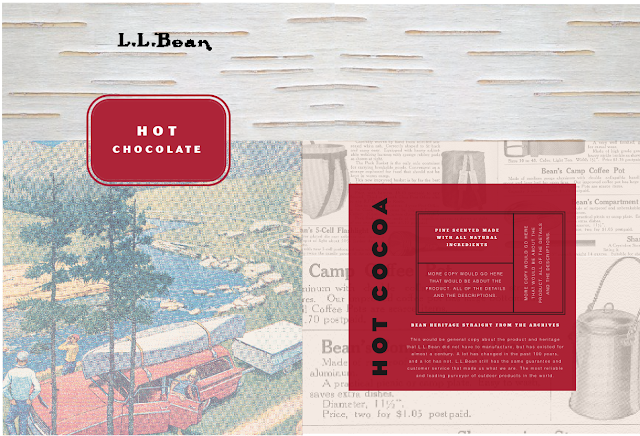
Being asked to contribute to the creative for the L.L.Bean 100th anniversary was a great honor. Particularly since the other particpants were Pentagram Design and TDA in Boulder. I was honored that my work was  selected amongst this formidable competition. This is a wonderful company with a great heritage, and I really enjoyed using the old catalogs as artwork for the site and packaging designs.

Collateral using archival catalog art and a simple message. 
Their iconic product with a modern interpretation.
Heritage catalog art and pages were used to create a beautiful packaging system.

Photo District News Self Promotion Award

We were recently honored to receive the Photo District News Self Promotion Award for Most Extraordinary Promotion. This was for a promo piece that was done a while back featuring a pin the tail on the donkey game as well as other children's activities. 

Identity and Portfolio Design for Sara Martini


Sara Jane Martini has spent twelve years as the Design Director of Visual Merchandising for the Americas at Quiksilver and Roxy, where she has been a contributing leader of the senior management team, creating compelling and groundbreaking retail environments in the world’s most prestigous venues. Sara Martini was instrumental in creating the Quiksilver and Roxy visual language and brand DNA, building it from the ground up in 2000, and has made it a leader in global fashion and performance apparel industry. We are currently collaborating on several retail environment projects. I am fortunate to have such a brilliant and talented sister.


sarajanemartini.com


Photographer Diane Casey Identity and Site


Diane Casey is an amazing photographer. We have collaborated on a number of promotional pieces, one which was awarded the Photo District News best promotion for 2008. This site entry was designed to show whimsy, animation, interactivity. Slickfish Studios brought the design vision to life.

www.dianecasey.com

Portfolio At A Glance


I have created a series of thumbnails of my favorite portfolio images. So, at a glance, you can really see what my visual aesthetic is. I have been fortunate enough to work with many world class photograhers, illustrators and printers. My design work is primarily strong visuals with a purpose, concept or story. I like to take each project to another level, push the limits of expectations. I love the wow factor, and I believe in designing "up" for the audience. I believe strong design is the foundation of any great brand.